The 76% nobody had designed for
I joined Citi as one of the first in-house designers. We were hired to replace agency spend on campaign work, not for the web and mobile experiences.
But we looked at the data anyway — and it changed not only our roles, but Citi’s banking channels for millions of customers.
Confidential details and unreleased features have been left out. This page covers design and UX strategy only and does not speak for Citi.
A year after launch, the old app had changed nothing
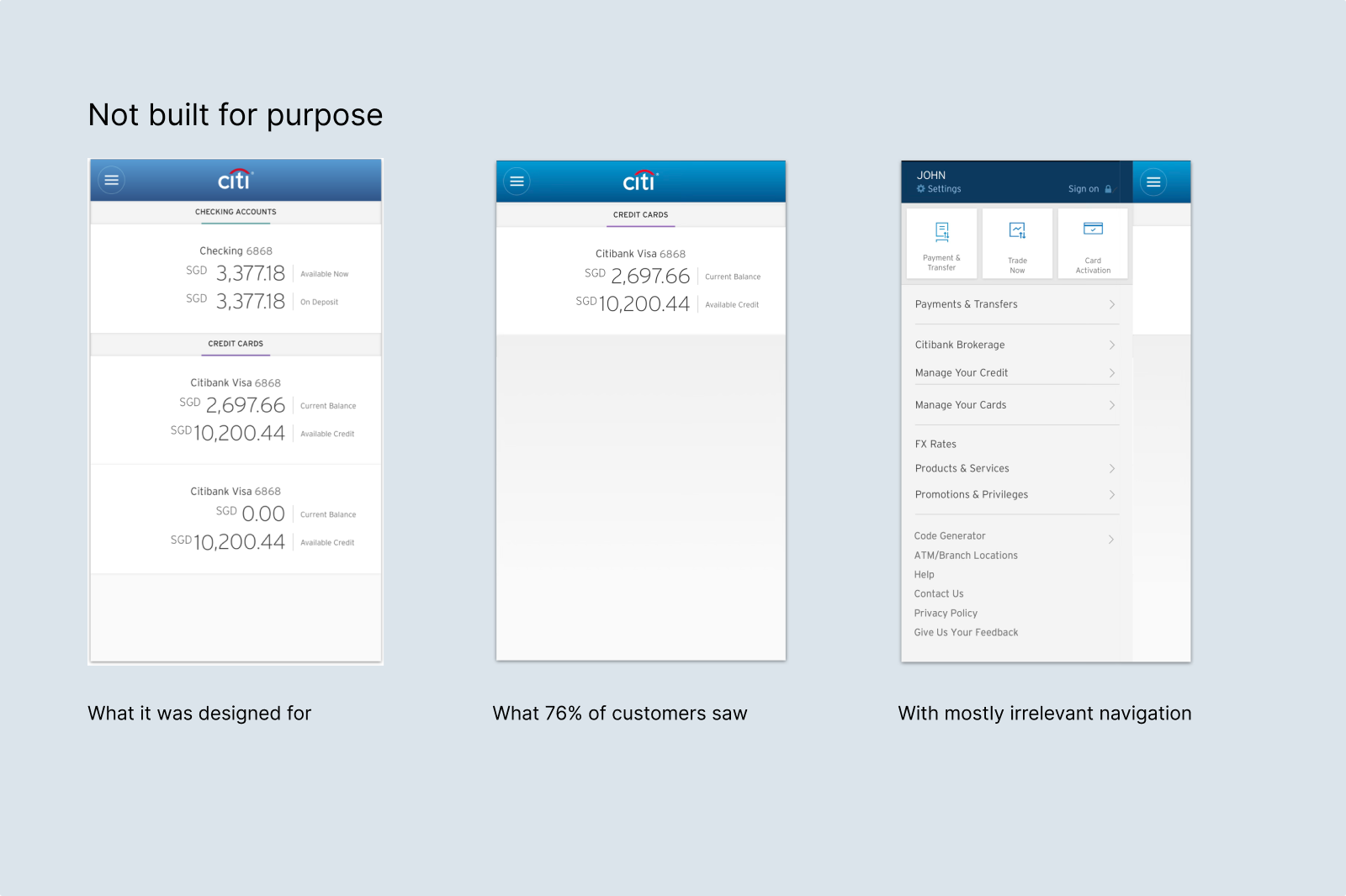
It was a banking app for mostly cards customers
Across the 14 markets, roughly two thirds of Citi’s customers held only credit cards. In the eight largest markets it was 76%. Nine in ten of them had a single card.
The app assumed the opposite. Its menus followed the bank’s business lines, its navigation started from products, and many important services still required a physical branch or a call. For a cards-only customer, seeing a balance and a few transactions was just like another paper statement. The simple usage problem — they had no reason to open the app. It became glaringly obvious when looking at the app from their lens.
Four reasons the initiative should have died — and why it didn’t
We had no mandate and no budget, and the old app had just been built.
Every reason not to do this was a good one.
The old app still had years to run on the books.
→ We wrote an incremental roadmap that could sit next to the quarterly targets instead of competing with them.No shared KPIs, no shared budget, no one owner for the app.
→ We avoided trying to align everyone and went to the line with the most to gain: Cards.Four segments, four relationship types, four back ends, all legacy.
→ We chose a small starting point that was buildable, not the ideal end state.Quarterly numbers counted. Research and customer satisfaction less so.
→ We worked with those who did believe, the cards BA, the head of marketing, the CTO and many others on the ground, and used what we built together to win the decision-makers.Two briefs, written by a tag team
None of this had a budget, and it did not need one yet. Time was the only cost, and 20 people gave theirs on top of their day jobs: business owners, BAs, product managers, engineers and market teams.
We wrote acceptance statements together: what the app had to do for the customer, and separately, what it had to do for the bank. Under each what was true at the time, which was mostly the opposite.
As a customer, I want an app that
- Is built for my relationship
- Uncomplicates the bank
- Lets me configure my products
- Proactively assists me
- Rewards me and gives me value
At the time
- Ignores whether I hold cards only, retail only, both, or am a wealth customer
- Menus follow business lines and product logic
- All servicing is phone or branch based
- Every process is a pull request from me
- Points and rewards live in a separate organisation
As bank, we need an app that
- Increases adoption, engagement, retention
- Generates revenue
- Lowers cost
- Can change and evolve easily
- Is scalable across regional complexity
At the time
- Previous app did not improve any metric
- Customers can’t find services and continue using branches and phone
- Many processes not digitised, local apps vary
- Hard-coded connectivity, no tracking
- Different offerings and back ends in every market
17 prototypes instead of a deck
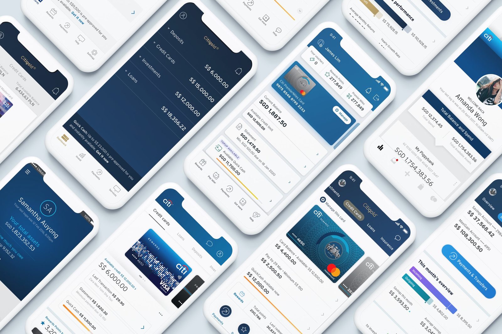
A strategy deck is easy to dismiss. A working app in your hand is not. We built prototypes instead of slides, tested them with customers in coffee shops, and reviewed each with the group for usability, feasibility and cost. After three months we had one worth showing.
Approved in ten minutes
The regional Head of Cards controlled the budget. He got an ad-hoc 10min meeting with the prototype on a phone, a 2 year roadmap built for profit, and three launch options. He approved it in the room.
The APAC and global heads of cards followed after a few more presentations while the cards team worked through the numbers. That approval paid for the first real research: five markets, all four relationship types, 130 people.
One app for three kinds of customer
The research confirmed the split and sharpened it. To some Citi was a credit card company. To another it held a complex relationship of deposits, FX and investments. Three groups covered most of the base: cards only, deposit accounts, investors. Each wanted an app that felt made for them.
What made a single app possible at all was that all of them opened it for the same two reasons. Action seekers came to do something specific and wanted to glance at their balance first. Information seekers came to check their balance and only then may want to act on what they saw. So the dashboard got a rule: after one second you know where you stand, after two you know what needs doing, after three you have started.
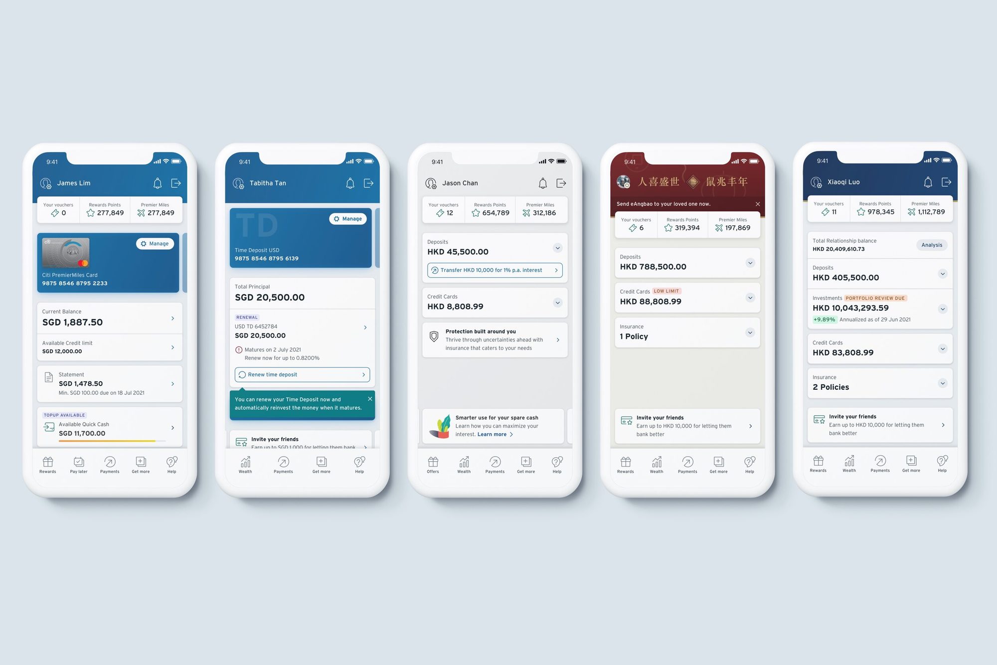
Within that rule we shaped the dashboard and the app’s navigation to each group. Cards-only customers saw an immersive card with spending and available credit at once; investors saw summarised balances with performance. Five combinations, one basic structure, so the app could be composed as per customer and run across all markets.
Every alert carries its own fix
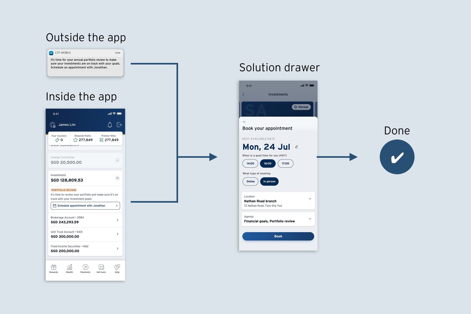
Banks alert customers by email, SMS and push, then leave them to find the right function or call. The alerts become noise and the action is missing. We moved the alert to where people were already looking: the balance. Any product could show a colour-coded label for a risk, an upcoming event or an opportunity, and every alert carried the button to resolve it.
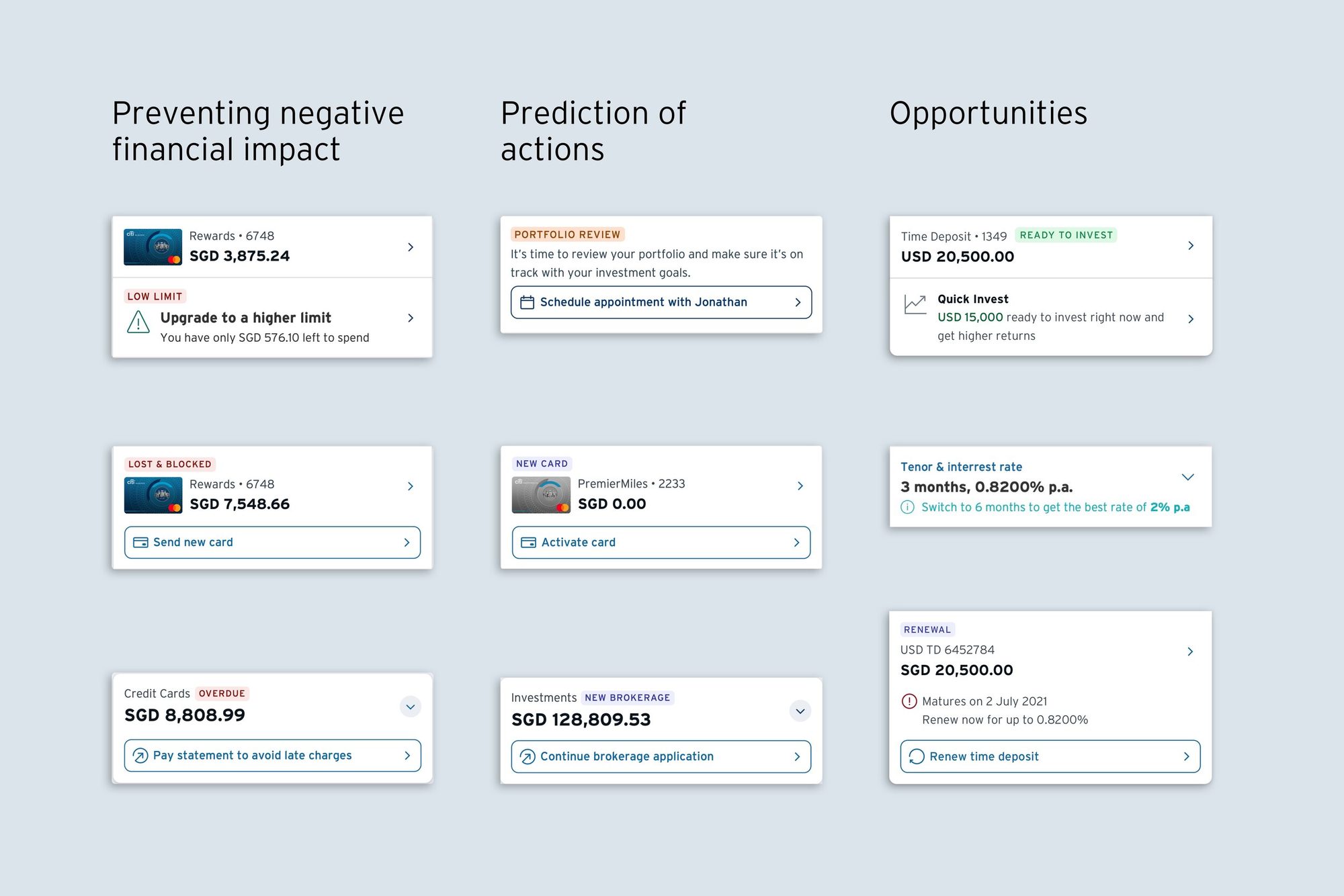
Because the app was modular, any flow could open from the alert that raised it. From a message to completion was never more than 3 steps, even from outside the app.
Paid for itself, then became the blueprint
The first release was the cards view, built on a parallel code base while the old app kept running. For a while the same app showed two experiences: cards customers saw the new one, everyone else the old one. That was the buildable starting point we had chosen, and it was enough to prove the case.
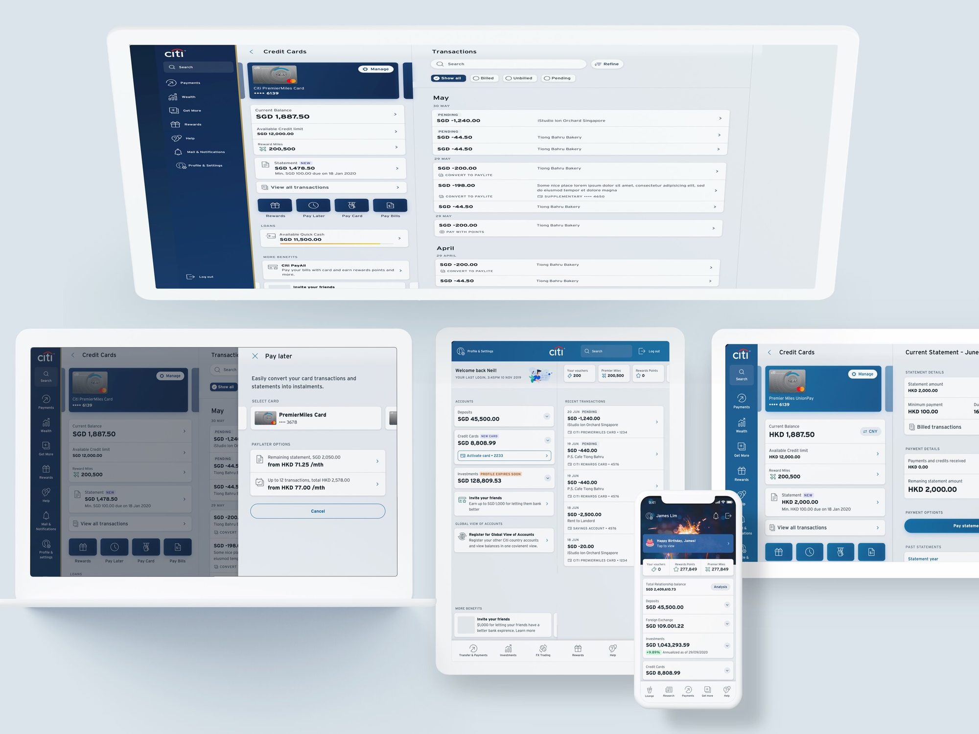
Customers logged in twice as often as before. NPS turned from negative to positive in every market. Design and build time fell by up to half, because the modular structure stemmed from a design system with approved components.
The cards view became the blueprint for the full relaunch — for the first time all 14 markets outside the US shared one experience, one platform, front end and back end.
Recognition
Best Digital Bank Asia Pacific 2018 · Global Finance Asia’s Best Digital Bank 2019 · Euromoney Digital Bank of the Year 2020 and 2021, Best Digital Bank for CX, Hong Kong 2021 · The Asset
Taking over the department
After the first version shipped I took over the function as Head of Experience Design and the team grew past twenty. I restructured it from fixed verticals, which were becoming silos, into groups built around the business lines — each group sat with the people who owned its numbers.
I realised that work needed to happen in two ways. Either it started from a business KPI and needed to be delivered against their timing. Or it started from something we discovered. The former had funding, the latter didn’t. The solution was to treat the latter as ongoing separate exploration streams. It became a backlog of ready solutions that we funnelled into the budgeted business requests.
#1 Business need process
KPI-originated, budgeted
Process 1 draws from process 2 journey backlog
#2 Free discovery process
User needs-originated, unbudgeted
Low cost methods enable process 2:
- In-app polls
- CS and call center mining
- RM feedback and interviews
- Tracking data
- App store verbatim
What I took from it
Three things made this work.
People cannot picture the effect of a better experience until they hold it.
Make the vision tangible early, and give everyone a hand in shaping it. Co-owners are the best co-drivers.
Nobody understands the business better than the P&L owner, the experience better than the designer, or the constraints better than the engineer.
Trust each one’s expertise, and assume you don’t know what you don’t know.
Everyone is wrong some of the time. The faster someone says so, the faster the group can fix it, together.
In a large organisation you have to work at this, and it is the cornerstone of the whole thing.