What unites traders is that they are all different
EQONEX (formerly Diginex) was a professional and institutional exchange for crypto and digital assets, with a separate Digivault custody.
The brief for its relaunch sounded plain at first: make traders trade more often and hold more assets with us. A hundred hours of conversations with customers later left us with one troubling finding.
The audience had one single commonality: Everything was different
Designing one platform when no two traders are alike
They differed in what they traded: spot market assets, long or short perpetual futures, dated futures, or basis trades. Some traded many times an hour in small amounts, others once a day for a single large sum. And several were running bots while others traded visually off chart indicators, working the order book alone, or holding several markets in parallel.
The one thing they agreed on breaks the first rule of UX
They all wanted the hallmark of a high-volume exchange: dense screens, high complexity, tiny fonts, cryptic labels. Simplicity, the rule almost every UX law rests on, was the wrong target. That was as far as the agreement went. Inside it, every trader had their own layout preferences and was quickly irritated when they were not met — 3 seconds delay in finding the right function can mean thousands of dollars in profit missed out.
Building journey personas for this audience was a near-futile effort. What worked instead was empathy, and defining four needs that every trader shared however differently they traded: customisation, multi-market trading, speed and orientation.
Four needs, four answers
Every trader wanted our screen to look like the exchange they came from, and every exchange looked different.
→ The screen broken into independent widgets.Almost everyone was in several markets at once, across several browser windows.
→ A market choice per widget, not per screen.Menus and long flows pull a trader away from where their focus belongs.
→ Nearly every function one click away.Dense screens tire the eye, and over a trading day the fatigue compounds.
→ A visual system that removes distractions, down to the divider lines.A screen made of widgets, on a grid that cannot break
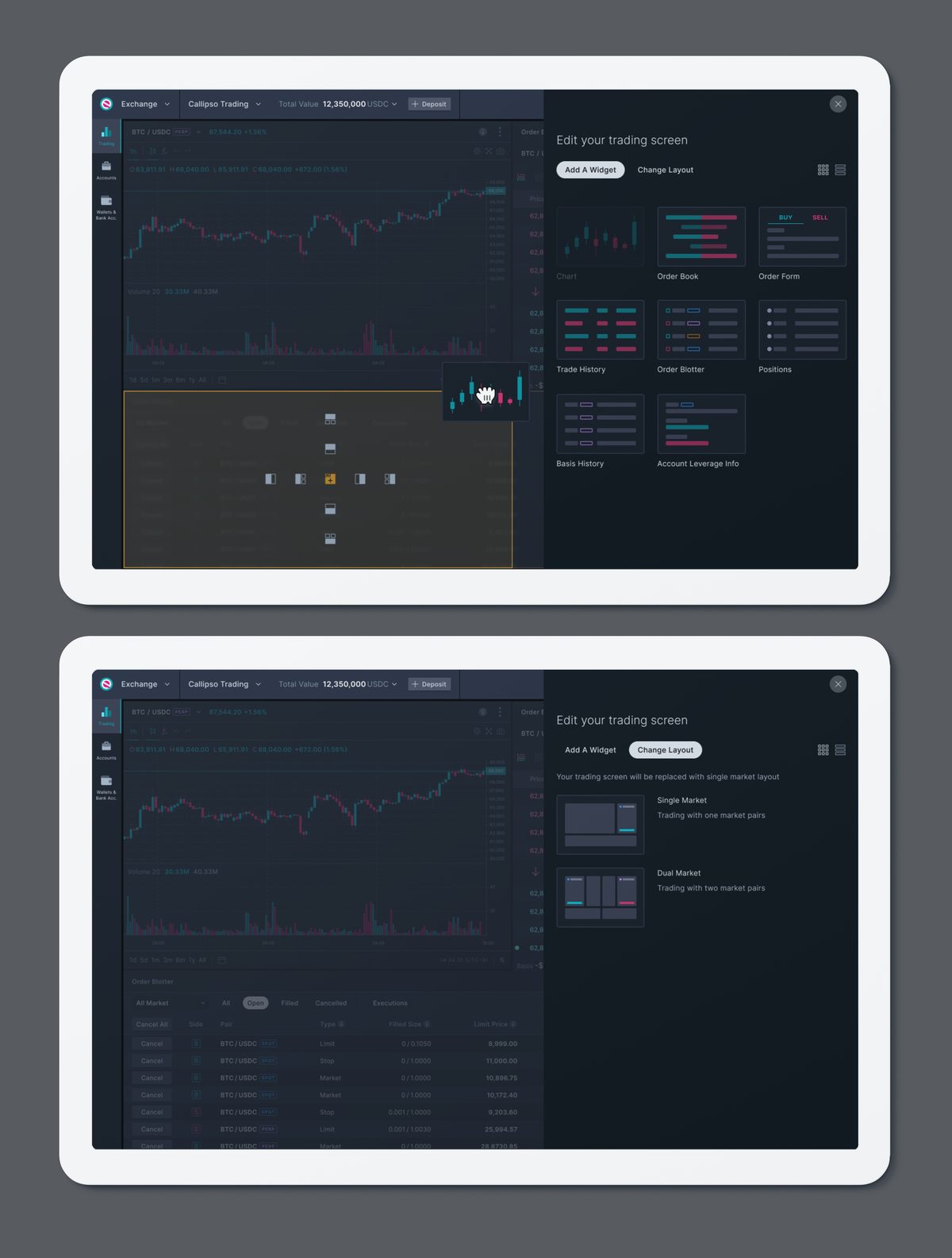
We converted the entire trading screen into independent widgets. Chart, order book, blotter, order form: each could be placed, scaled or removed freely with no effect on the others, and new ones dragged in without limit.
An intelligent grid did the work that would otherwise fall to the trader. It prevented overlaps and gaps, kept the layout sound as the browser resized, and let a single click revert everything to the default screen, so rearranging was safe and nobody could destroy a working screen by accident.
A market per widget, not per screen
Watching traders work several markets across several browser windows showed a constant struggle with space, window arrangement and window focus, and all of it at the expense of confidence and speed.
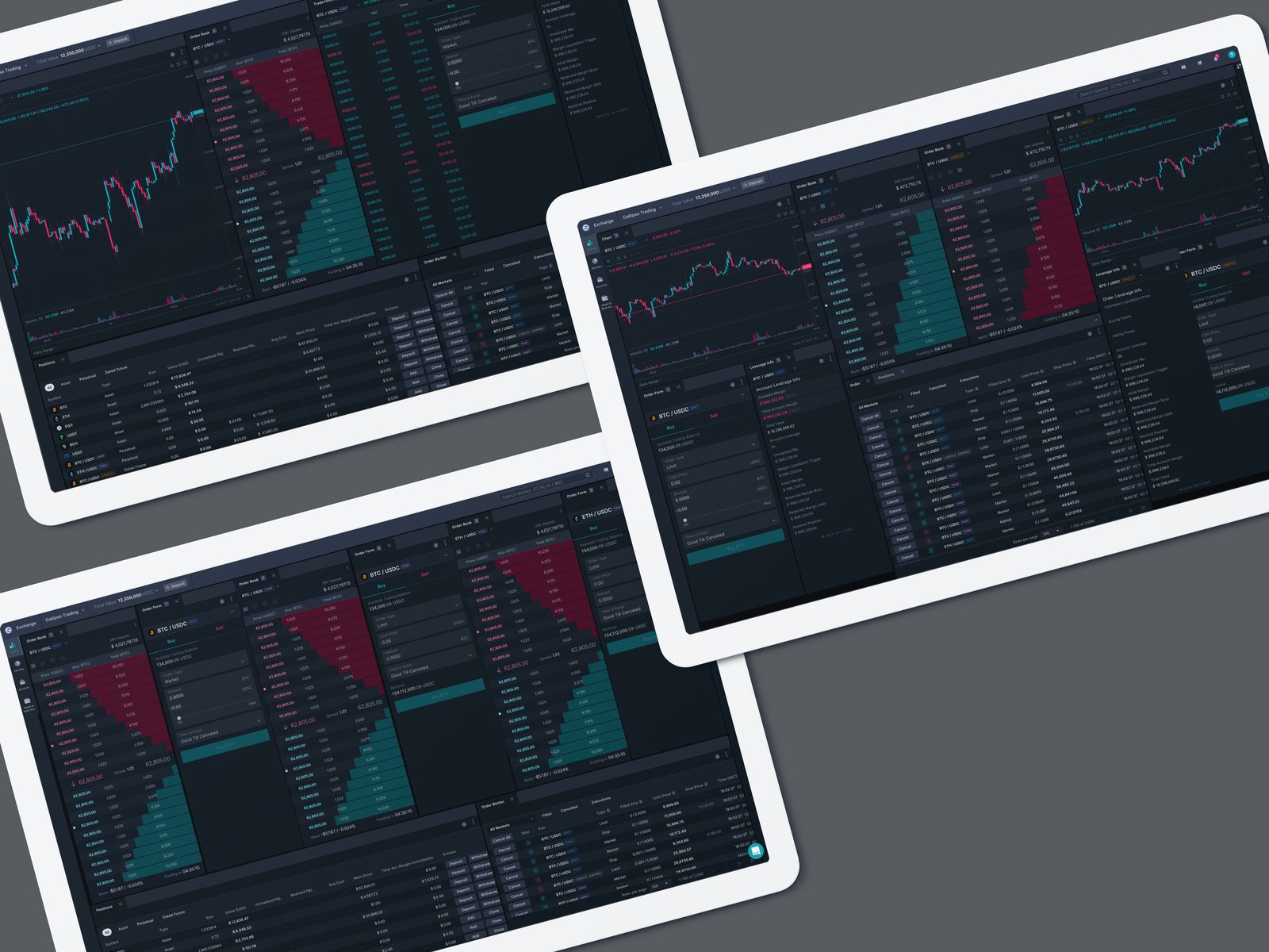
So instead of choosing a market for the whole screen, they chose a market per widget. A chart, order book and order form for BTC/USDC spot, and the same three again for BTC/USDC perpetual, both markets traded in one window without taking their eyes off the screen. Order-book traders removed the chart entirely and ran two or three groups of order books and order forms, trading markets against each other on the spread.
Everything one click away
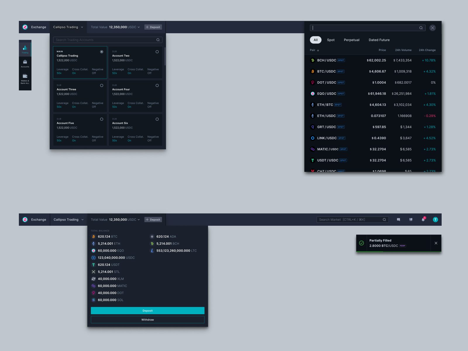
Digital assets move fast, and every menu or long flow pulls a trader away from where their focus belongs. We made sure that nearly every function was a single click away, and created overlays for the frequent non-trading flows — switching sub-accounts, checking balances, scanning other markets, transferring funds. That meant the market stayed visible while the task got done. Feedback came as static banners and sonified toast messages, designed to be understood without looking at them.
A design system for density without distraction
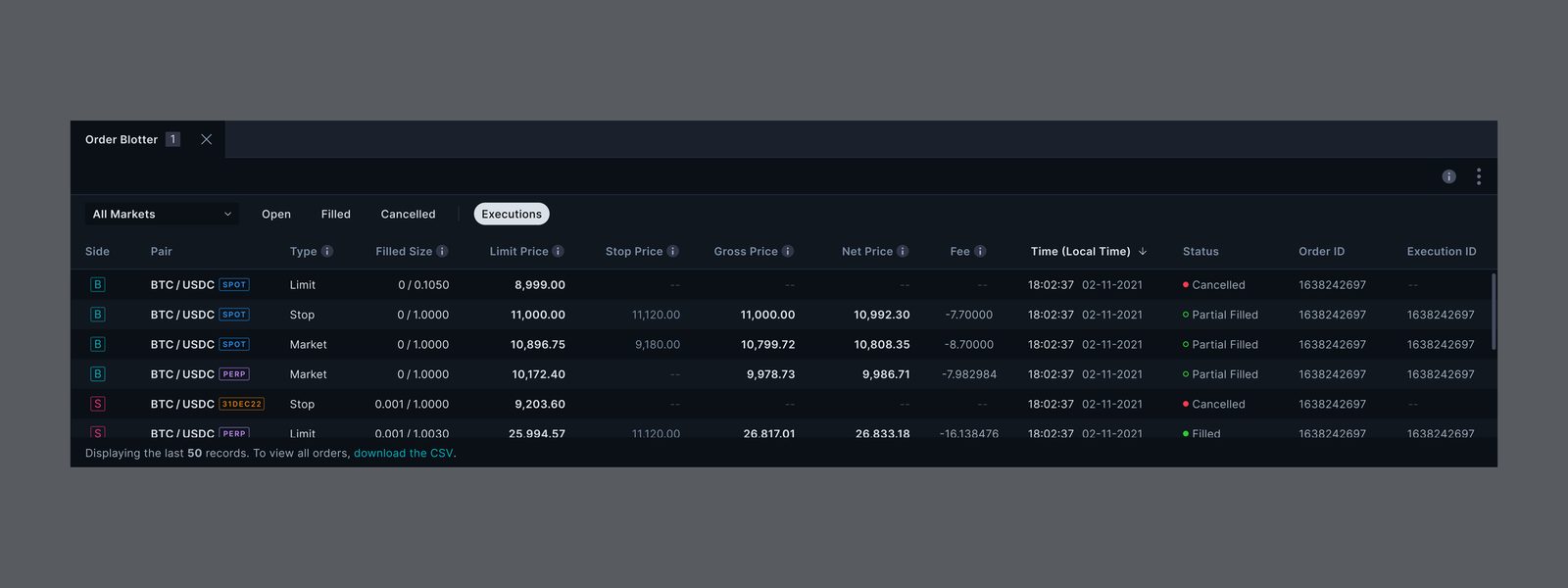
At this density every moment of refocusing is a small tax, and across a trading day it compounds into fatigue. High contrast and divider lines need to be avoided. We needed a visual hierarchy strong enough to be read at a glance. The design system we created was built to deliver it with four key pillars.
Fewer windows, fewer errors, more trades
The multi-market screens removed the need for several browser windows. Traders made fewer errors and traded more often. Unfortunately I have no figures that I can publish for this case; the observations and results come directly from the traders we watched and the feedback we collected after launch.
Running the function
I led user experience and design for the exchange with a team of five across Singapore and Hong Kong, covering spot and derivatives trading. Particle, the design system, was built alongside the product so that the widgets and the hierarchy came from one set of rules.